For most of Google's history, its crawler visited your website as a desktop computer. The desktop page was the one Google stored, judged and ranked, even when the person searching was on a phone.
By the mid-2010s more searches came from phones than from computers. Many sites showed phones a cut-down version with less text, fewer links and missing details. Google was ranking pages on content that most visitors never saw. Mobile-first indexing fixed that by flipping the order: the phone version comes first.
What mobile-first indexing means
Google uses the smartphone version of Googlebot to crawl your pages. Whatever that crawler sees is what Google indexes and ranks, for both mobile and desktop searches.
It is not a separate “mobile index”. There is one index. It is simply built from the mobile version of your site.
The eight-year timeline
| Date | What happened |
|---|---|
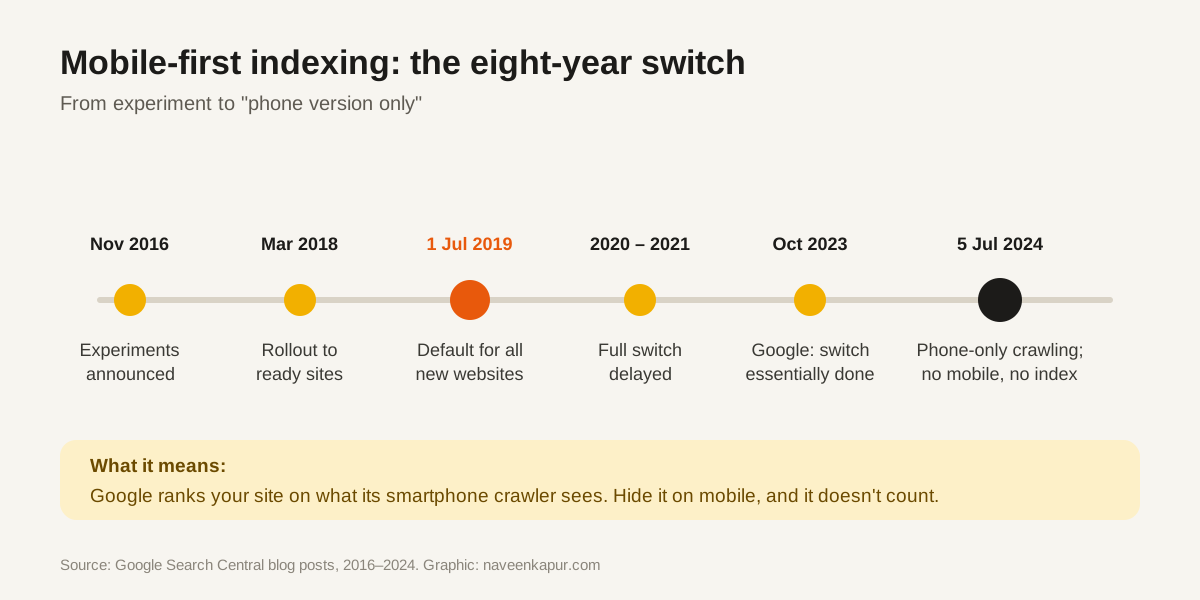
| Nov 2016 | Google announces it is experimenting with mobile-first indexing |
| 26 Mar 2018 | Rollout begins for sites that are ready |
| 1 Jul 2019 | Default for all new websites |
| 2020 – 2021 | The full switch for older sites is delayed more than once |
| Oct 2023 | Google says the move is essentially complete |
| Dec 2023 | Mobile-Friendly Test tool and Search Console Mobile Usability report retired |
| 5 Jul 2024 | All sites crawled with Googlebot smartphone; sites not accessible on mobile may stop being indexed |
Three ways to build a mobile site, and the risk in each
| Setup | How it works | Mobile-first risk |
|---|---|---|
| Responsive design | Same URL, same HTML, layout adapts to the screen | Lowest. Google's recommended option. |
| Dynamic serving | Same URL, different HTML for phones | Medium. Easy to leave things out of the mobile HTML. |
| Separate mobile site (m.example.com) | Different URLs for phones | Highest. Content, links and tags must be matched on both. |

The mobile-first checklist
- 1Same main content on mobile and desktop. Text you remove on phones to “keep it clean” is text Google does not see.
- 2Same headings and title tags. Do not shorten them on mobile.
- 3Same structured data (FAQ, product, article, breadcrumb) on the mobile version.
- 4Same meta robots tags. A “noindex” on the mobile page removes the page.
- 5Images and videos on mobile with the same alt text and crawlable URLs.
- 6Do not lazy-load main content only after a tap or swipe. Googlebot does not tap.
- 7Do not block CSS, JavaScript or images in robots.txt.
- 8Internal links in the mobile menu and footer, not only on desktop.
- 9Server capacity: a mobile site on a weak server may get crawled less.
How to check your site today
- Search Console → URL Inspection: shows the page as Googlebot smartphone saw it, including a screenshot and the rendered HTML.
- Search Console → Settings → Crawler: shows which Googlebot is crawling your site.
- Lighthouse in Chrome DevTools, mobile mode: checks viewport, tap target size and font size.
- Your own phone: compare a key page side by side with the desktop version. Is anything missing?
Mobile-first indexing also explains why mobile scores matter most for Core Web Vitals, and why the basics of on-page optimisation (titles, headings, internal links) must be present on the phone version of each page, not only on desktop.